CSS
CSS - Cascading Style Sheets
- a browser’s style
- an author’s style
- a user’s styles
Benefits of styles
- The separation of code and design;
- Different design for different devices;
- Extended methods to design elements over HTML;
- Accelerate site download speed;
- The only style design set for all documents on a web site;
- Centralized storage.
How to add styles to the page
External style
Global page styles
Global or file imports
Tag inner styles
How to add styles to the page.
All described methods of using CSS can be used either alone or in combination with each other. In this case, is necessary to remember their hierarchy.
- tag inner style - highest priority
- global style, external style - lower priority
Device Types
Specify the type of media. @import
Specify the type of media. @media
Specify the type of media. Attribute “media”
The basic syntax of CSS

Coments in css
Priority Matters
Types of css values
Strings
Numbers
URLs
Keywords
Types of css values
Colors
- By hexadecimal values: #6609CF, #fc0
- By name: white, silver, gray, black, red, orange, ...
- RGB: rgb(255, 0, 0)
- RGBA: rgba(0,255,0,0.3)
- HSL: hsl(120,100%, 25%)
- HSLA: hsla(120,100%, 50%, 0.3)
Types of css values
Dimensions. Relative units
em, rem, px, %, vw, vh, vmin, vmax
Dimensions. Absolute units
in, cm, mm, pt, pc
Selector. Tag
Selector. Class
Selector. ID
Context Selectors
Next Selector
Direct Children Selector
Attribute Selector
Advanced attributes selectors
Pseudo classes
Pseudo elements
Grouping
Inheritance
Cascading
Cascading refers simultaneous use of different style rules to document elements by connecting multiple style files, inheritance of properties and other methods.
- Browser’s style
- Author’s style
- User’s style
- The author's style adding !Important
- The user’s style adding !Important
Selector’s weight

For each identifier (hereinafter denote the number through a) there are 100 point, for each class and pseudoclass (b) there are 10 point for each tag selectors and pseudoselector (c) there is 1 point. Composing listed values in any particular order, we obtain the weight for the selector
Selector’s weight
STYLE ---- ID ---- CLASS ---- ELEMENT

text
- color
- text-indent
- text-align
- text-decoration
- letter-spacing
- text-transform
font
- font-family: family-name | generic-family
- font-style: normal | italic
- font-variant
- font-weight
- font-size: length | percentage
- font: [font-style | font-varian | font-height] font-size [line-height] font-family
- font: bold 24px Tahoma;
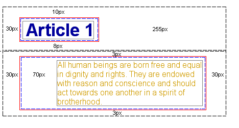
Margin
- margin: top right bottom left
- margin-top: length | percentage | auto
- margin-right: length | percentage | auto
- margin-bottom: length | percentage | auto
- margin-left: length | percentage | auto
Display
- block
- inline
- inline-block
- none
- table, inline-table
background
    background: color image position/size repeat
            origin clip attachment initial|inherit;
- background-color
- background-image
- background-repeat
- background-attachment
- background-position
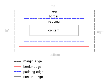
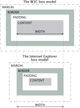
Box model
Box model (IE)
    * {
      box-sizing: border-box;
    }
border
- border-width
- border-color
- border-style
- border
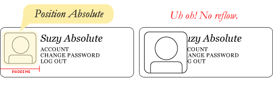
Positioning
    .element {
      position: static; /* default */
      position: relative;
      position: absolute;
      position: fixed;
    }
Floating
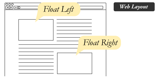
    .element {
        float: left;
    }
Floating
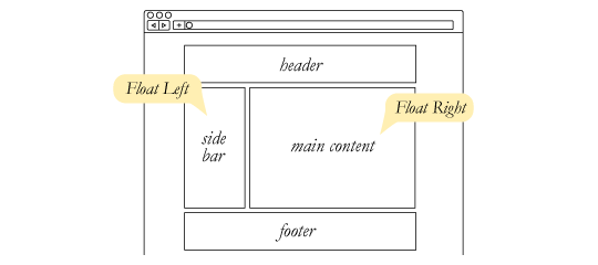
    .element {
        float: right;
    }
How Browser Works?
http://arvindr21.github.io/howBrowserWorks
http://www.html5rocks.com/ru/tutorials/internals/howbrowserswork/
Reflow
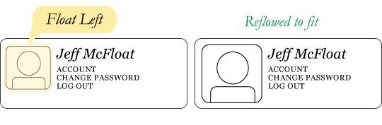
    .element {
        float: left;
    }
Reflow
    .element {
        float: left;
    }
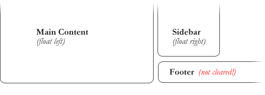
Clears
Clears
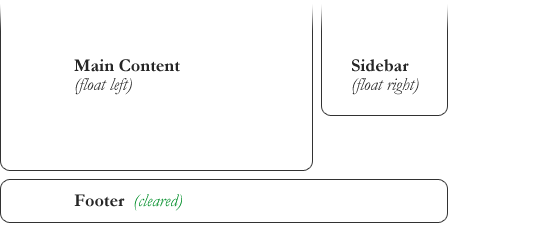
    .footer {
        clear: both;
        float: none;
    }
Clearfix
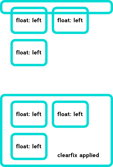
    .clearfix:after {
      visibility: hidden;
      display: block;
      font-size: 0;
      content: " ";
      clear: both;
      height: 0;
    }
    .clearfix { display: inline-block; }

    * html .clearfix { height: 1%; }
    .clearfix { display: block; }
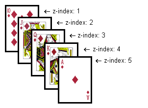
z-index
Vendor prefixes
- -webkit- (Chrome, newer versions of Opera.)
- -moz- (Firefox)
- -o- (Old versions of Opera)
- -ms- (Internet Explorer)
standarts & validators
Overflow
overflow: auto | hidden | scroll | visible | inherit;Visible

Overlap

Hidden

Auto

Scroll

Border Radius
border-radius: <radius>{1,4} [ / <radius>{1,4}];border-radius: 10px; border-radius: 10px 20px; border-radius: 10px 20px 10px 20px; border-radius: 10px 20px 10px 20px / 10px 20px 10px 20px;; border-top-left-radius:0; border-top-right-radius: 0; border-bottom-right-radius: 0; border-bottom-left-radius: 0;

Box Shadow
box-shadow: none | <shadow> [,<shadow>]*
where <shadow>:
inset? <x shift> <y shift> <blur radius> <length> <color>
Gradients

linear-gradient(
[ <angle> | to <side-or-corner> ,]? <color-stop> [, <color-stop>]+ )
\---------------------------------/ \----------------------------/
Definition of the gradient line        List of color stops

where <side-or-corner> = [left | right] || [top | bottom]
and <color-stop>     = <color> [ <percentage> | <length> ]?
linear-gradient( 45deg, blue, red ); /* A gradient on 45deg axis starting blue and finishing red */
linear-gradient( to left top, blue, red); /* A gradient going from the bottom right to the top left starting blue and
finishing red */
linear-gradient( 0deg, blue, green 40%, red ); /* A gradient going from the bottom to top, starting blue, being green after 40%
and finishing red */Web fonts

@font-face {
font-family: 'MyWebFont';
src: url('myfont.woff2') format('woff2'),
   url('myfont.woff') format('woff'),
   url('myfont.ttf') format('truetype');
}
Google fonts
@import url(//fonts.googleapis.com/css?family=Open+Sans);

body {
font-family: 'Open Sans', sans-serif;
}
Fonts Generator
FontsquirrelIcons
IcomoonFontello
Font-Awesome
Bootstrap
Z-Index

div {
z-index: 1; /* integer */
}}
Transitions
transition: <property> <duration> <timing-function> <delay>;CSS3 Transforms
transform: <type>;- translate()
- rotate()
- scale()
- skewX()
- skewY()
p {
border: solid red;

-webkit-transform: translate(100px) rotate(20deg);
-webkit-transform-origin: 0 -250px;

transform: translate(100px) rotate(20deg);
transform-origin: 0 -250px;
}Animation
/* @keyframes duration | timing-function | delay |
iteration-count | direction | fill-mode | play-state | name */

@keyframes example {
from {}
to {}
}

@keyframes example {
0%   {}
25%  {}
50%  {}
100% {}
}
/* @keyframes duration | timing-function | delay |
iteration-count | direction | fill-mode | play-state | name */
animation: 3s ease-in 1s 2 reverse both paused slidein;
/* @keyframes duration | timing-function | delay | name */
animation: 3s linear 1s slidein;
/* @keyframes duration | name */
animation: 3s slidein;THE END
Additional materials